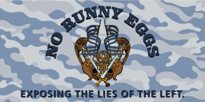
A while back, I blegged for some help with a new logo. A couple of people stepped up and delivered what I consider ass-kicking logos. Here’s where I need your help in helping me decide which one.
First up, a design from J. Gravelle from The Daily Scoff:

Next up, a design from Mr. Tastic from Neo-Con* Tastic:

What should be the new logo of NRE?
Up to 1 answer(s) was/were allowed
- J. Gravelle's design (65%, 13 Vote(s))
- Mr. Tastic's design (20%, 4 Vote(s))
- J. Gravelle's design with Mr. Tastic's camo background (10%, 2 Vote(s))
- Mr. Tastic's design with no background (10%, 2 Vote(s))
- Keep the current non-logo (10%, 2 Vote(s))
Total Voters: 23
I can’t promise to abide by the vote if it’s either close or sparsely voted upon, but the best way to make sure I do so is to vote for your favorite and get your friends to do the same. I’ll leave this up until the wee hours of October 13th, so you have some time to get them in line.
One side note – sorry to disappoint those of you who wanted the fedora as my Twitter icon, but the nuke is staying for a while thanks to Matt Kenseth self-destructing yesterday.
Revisions/extensions (3:27 pm 9/27/2010) –You’re not dealing with the Milwaukee Election Commission, the Government “Accountability” Board, or Chicago election officials here. I’ve already had to wipe out 4 “votes” that came from somebody who had already voted. No, I won’t tell you how I know the system was gamed.
What? We have a current logo?
They’re both top-notch, but the first one is better in my opinion.
Could be worse:
http://bit.ly/akKfJd
-jjg