“There’s no difference between Hillary and Obama!”
“McCain’s no conservative, he’s Democrat Lite!”
“Bush sold himself as a Conservative but has turned out to be just another RINO”
In the most thorough review of the topic that I’ve seen, Keith Poole and associates at the University of California, San Diego have compiled a review of all member of Congress, House and Senate, and analyzed who’s who in the political zoo.
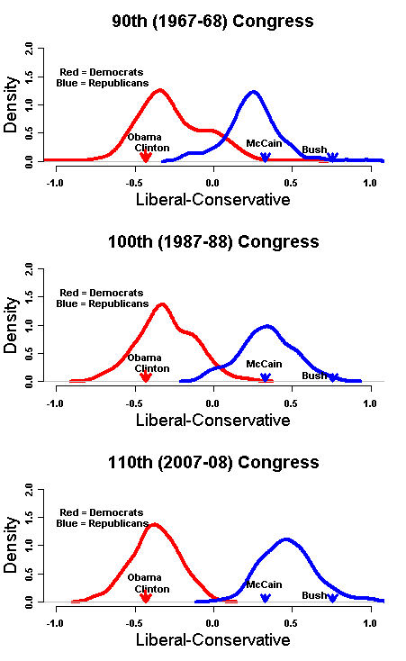
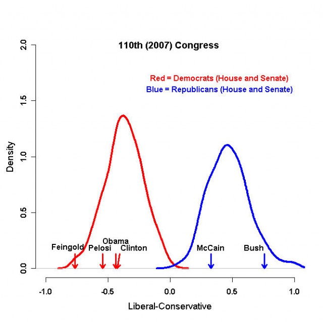
In this first graph we see the confirmation and correction, to several of our “Truths.”
- Hillary and Barack are “Change you can Xerox.” Contrary to what Hillary’s campaign is trying to tell people, this study shows that Hillary’s record is to the left of the Democratic party and is imperceptibly different from Obama.
- McCain is clearly from the left side of the Republican Party. As I posted in my first post on this site, McCain touts his lifetime Conservative voting record. However, if you look over the past few years, and especially the most recent, McCain’s voting record has moved to the left. The study has a great animated graph that shows how McCain’s voting record began squarely in the middle of Republicans but over time has become an outsider of the Republican members.
- Contrary to the feeling of many Conservatives, Bush lines up to the right. The question that this raises for me is “To the right of what?”
Side note for MN and WI readers, Wellstone and Feingold were nearly identical and (dramatic pause for the launch of a surprise statement) they are WAAAAAY to the left of the spectrum.
“I didn’t leave the party, The Democratic Party left me.”
This graph shows how over time, that sentiment has validity. Look at how in the 60’s, the Democratic party included members that were nearly to the center of the Republican Party. As time progresses, note how the party consolidates to the left. To be fair, also note on the Republican party consolidates to the right. The question that remains for me is a bit of chicken and egg; did the Democratic Party move to the left thereby creating the distinct separation from the Republican Party or was this a progression of both parties? As objectively as I can, my opinion would be the prior but I think it was through a combination of further left orientation combined with the loss of members like Ronald Regan, Charlton Heston and Zell Miller, folks who clearly would have been the group who crossed over with(and some later became) Republicans.

A couple of other observations:
- If the Dems and Reps are representative of the left and right positions of the American population as a whole, you can imagine a bell curve of that population overlaying these two curves. Imagine a bell curve that starts at the left of the Dem curve, rises and peaks above either the Dem or Rep line at 0.0 and then tails off to the right to finish at the end of the Rep curve. If you imagine the space under the peak of that curve that does not fall within the Dem or Rep curves, you would find the folks generically referred to as “The middle.” Just in terms of space ratio, recognize how many people that area represents compared to either the Dem or Reps. If you had doubts about the important of these folks in an election, doubt no more.
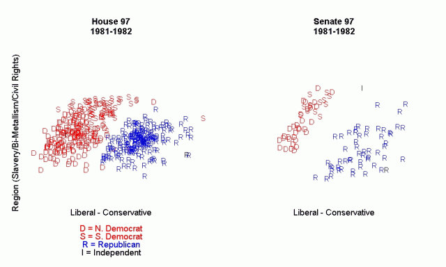
- The final graph in the report is incredibly telling. I won’t put it in here because I don’t want to muck up the site. The graph shows an animation of voting positions for both the House and Senate starting in 1981 through today. While the Senate shows some consolidation and separation between Dem and Rep over time it is the House that shows the stark polarizing that has become today’s politics. As you watch the graph, note how the House separation dramatically accelerated around the mid 90’s. Repeat after me….”Contract with America.”
I won’t bore you with other observations. H/T to Ed Morrissey at Looktruenorth.com. He has a more thorough analysis of this study here. I urge you to read his thoughts.
Revisions/extensions (1:12 pm and again 1:15 pm 5/2/2008; steveegg) – Just adding the animated GIF (or at least attempting to)…

Click for the full-sized, animated version. The media center doesn’t much like animated GIFs.

Extremely interesting. I’ll have that last graphic up shortly; animated GIFs don’t muck things up (or at least they haven’t in the past).